
Flutter Widgets হল ফ্লাটার এর বিল্ডিং ব্লক। একটি অ্যাপ্লিকেশন এর ভিউ দেখতে কেমন হবে উইজেটগুলি তাদের বর্তমান কনফিগারেশন এবং অবস্থার ভিত্তিতে বর্ণনা করে ।
উইজেট: ফ্লাটার অ্যাপের স্ক্রিনের প্রতিটি উপাদান একটি উইজেট। স্ক্রিনের দৃশ্য সম্পূর্ণরূপে অ্যাপটি তৈরি করতে ব্যবহৃত উইজেটগুলির পছন্দ এবং অনুক্রমের উপর নির্ভর করে। আর একটি অ্যাপের কোডের গঠন হল উইজেটের একটি tree।
উইজেটগুলির বিভাগ: প্রধানত 14টি বিভাগে ফ্লাটার উইজেটগুলিকে ভাগ করা হয়েছে। তারা প্রধানত একটি ফ্লটার অ্যাপ্লিকেশনে প্রদান করে কার্যকারিতার ভিত্তিতে আলাদা করা হয়।
- Accessibility: These are the set of widgets that make a flutter app more easily accessible.
- Animation and Motion: These widgets add animation to other widgets.
- Assets, Images, and Icons: These widgets take charge of assets such as display images and show icons.
- Async: These provide async functionality in the flutter application.
- Basics: These are the bundle of widgets which are absolutely necessary for the development of any flutter application.
- Cupertino: These are the ios designed widgets.
- Input: This set of widgets provide input functionality in a flutter application.
- Interaction Models: These widgets are here to manage touch events and route users to different views in the application.
- Layout: This bundle of widgets helps in placing the other widgets on the screen as needed.
- Material Components: This is a set of widgets that mainly follow material design by Google.
- Painting and effects: This is the set of widgets which apply visual changes to their child widgets without changing their layout or shape.
- Scrolling: This provides sacrollability of to a set of other widgets that are not scrollable by default.
- Styling: This deals with the theme, responsiveness, and sizing of the app.
- Text: This display text.
উইজেটের প্রকার: ফ্লটারে প্রধান উইজেট দুই ধরনের :
- Stateless Widget
- Stateful Widget
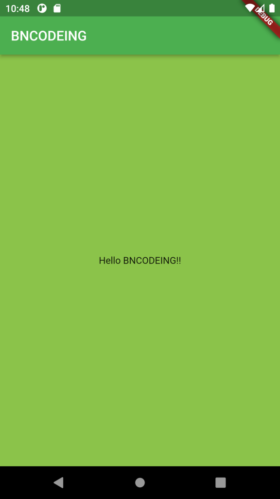
import 'package:flutter/material.dart';

void main() => runApp(BNCODEING());

class BNCODEING extends StatelessWidget {
  @override
  Widget build(BuildContext context) {
    return MaterialApp(
      home: Scaffold(
        backgroundColor: Colors.lightGreen,
        appBar: AppBar(
          backgroundColor: Colors.green,
          title: Text("BNCODEING"),
        ),
        body: Container(
          child: Center(
            child: Text("Hello BNCODEING!!"),
          ),
        ),
      ),
    );
  }
}
Description of the Widgets Used:
- Scaffold – Implements the basic material design visual layout structure.
- AppBar – To create a bar at the top of the screen.
- Text – To write anything on the screen.
- Container – To contain any widget.
- Center – To provide center alignment to other widgets.
